

Marvel Comics Presents ran for 175 issues from 1988 until 1995. Each issue included four eight-page stories with typically two or three on-going features (and no ads). It spotlighted some of the leading creators of mainstream comics over a period of precipitous economic growth and even more rapid decline. Reading through it is an opportunity to revisit any number of weird aspects of 90s superhero comics. This blog is a primitive, oddly regimented, manifestly scattershot crawl through an often disappointing but occasionally splendid comic. All image copyrights are Marvel's. Issue credits linked below. Updated on Wednesdays.
Marvel Comics Presents #35: Mid November 1990(5.20.20)
Credits: grandcomicsdatabase
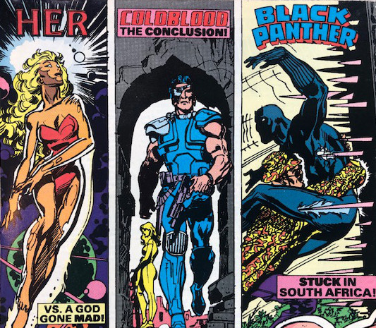
Given that MCP ranges across the MCU, the varying cornerboxes are fun touch. And, since Coldblood will effectively disappear from continuity after this issue (save a fitting appearance in Deathlok--the character he's a thin proxy for), it's mystifying that the perfectly lovely cornerbox from #26 has been swapped out for a dull, poorly scaled one. Fishy design similarly afflicts the Grindberg cover, which takes a lovely premise--Nightcrawler on a highwire--and flops into dreary mess. Gooey piles of creatures, viewed from behind, leave one of the more fun characters tucked illegibly into the frame. (Note that the cover date is actually earlier than last issue's cover date. Go figure.)
A. Excalibur, "Having a Wild Weekend" [5/8]
The forced march through the entire team fighting with knockoff cartoon characters continues. The mandate of energy at the cost of legibility also seems to be in full effect. There's no easy way to understand the physical space in which Nightcrawler is being tossed about. While some might claim that's evidence of "madcap energy," there's no principled reason to believe that's so.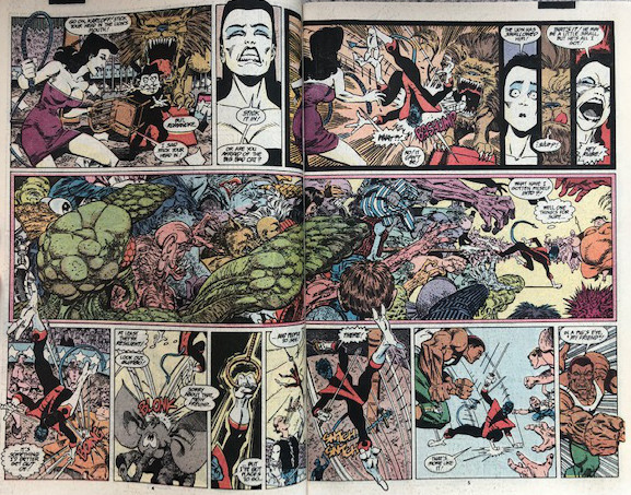
Larsen does seem to be enjoying himself a bit--for example, by sneaking Vanguard into a panel--but there's a laggy feel here, with characters talking through their teeth and too much friction in the panel transitions. This feature now feels about three installments too long.
B. Black Panther, "Panther's Quest" [23/25]
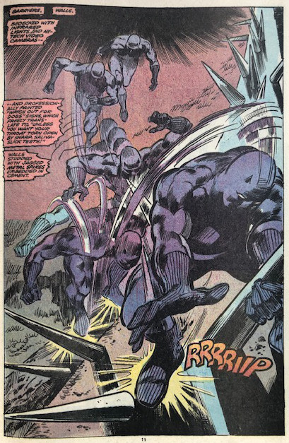
Black Panther lands his plane, kills a guard, escapes a dog, and gets caught in bear trap. But, of course, this is Colan and McGregor so there's whispy, stroboscopic action throughout and each panel is replete with hefty narration. Stepping back, it's interesting to ask whether there's a benefit to "McGregor-ing" actions that would nowadays be presented in pantomime (most obviously, sneaking into a building). Granted, it pulls the eyes away from the pictorial, but it slows the general engagement with the page down. At the basest level of "time with eyes trained on panels" it might be a wash, but, when it comes to feeling inside the story, I'm increasingly sympathetic to what McGregor's trying to do here.
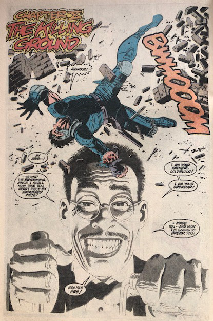
C. Coldblood, "Rise and Shine" [10/10]
An apt concluding installment. There are some jaw-dropping panels here with funky Gulacy and Glynis Oliver hacks--most notably, a kind of three-color hold (or something) splash and some beautifully rendered loafers. There's also hard to parse return of a tertiary character at the singular dramatic apex of the feature, which saps any real concluding energy. Other oddities are sprinkled throughout like a hand that was presumably re-inserted at the behest of the CCA and some dashed off, limp dialogue.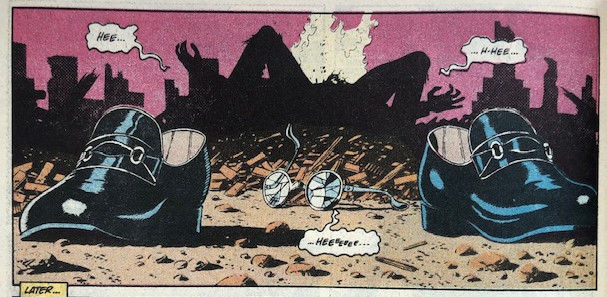
It's hard, too, to ignore the Egg Fu-ish vibes emanating from Mako, the villain of the piece. Despite a promising start, this feature sputtered out quickly and, if it deserves any subsequent attention, it's only to pad out a different Gulacy artist edition or similar volume.
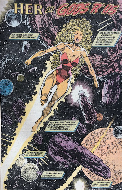
D. Her, "Gods 'R Us"
Nicieza could have just as well swapped Frankie Raye, Captain Marvel, or most anyone for this odd bit of moralizing. Her arrives on a garbage planet and immediately senses and deposes a vaguely powered world ruler. She insists that her former subjects refrain from killing him and then they all pick up spades and trowels to fix the planet. It's difficult to imagine crafting a story with less complexity. Her does nothing interesting. The bad guy has no interesting features to speak of (though it's a fun enough design).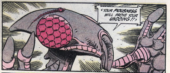
It's like a story-schema with unsaturated character roles. Interestingly, Larsen also draws this story and, boy, is his BWS something. There's a hell of a lot of screentone and gratuitous astronomical debris throughout. It's a doodly, fun feel. So, yeah, goofily overstuffed pictures, impressively vacuous story.
Power Ranking: Black Panther (B+), Coldblood (B-), Excalibur (C+), Her (C-)